campeones Posted: 16:34 Apr24 2012
Post ID: 3108847
campeones

Posts: 38
Post Likes: 0
Post Likes: 0
No one gave me any feedback for my last one in my last topic, and if I were to post there again, it'd be like a triple post, so I figured I'd just make a new topic.
Anyway, I've been practicing this stuff. Here's my latest try:
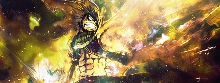
Anyway, I've been practicing this stuff. Here's my latest try:
Craizen Posted: 21:57 Apr24 2012
Post ID: 3108893
Craizen
A'ight


Posts: 8,105
Post Likes: 66
Post Likes: 66
That's not bad at all :o
The colors are a little wonky, but you have some decent effects going on, and okay blending.
Really focus on where you want your lighted areas so your focal/tag isn't over lighted.
The colors are a little wonky, but you have some decent effects going on, and okay blending.
Really focus on where you want your lighted areas so your focal/tag isn't over lighted.
Yogi_Bear Posted: 22:45 Apr24 2012
Post ID: 3108897
Yogi_Bear

Posts: 2,113
Post Likes: 0
Post Likes: 0
I like it, you've got some nice effects going on there. Like Kevin said, watch the lighting, it's overall too bright. I think it's maybe blended a bit too well, especially at the bottom of the render. I feel like cropping off some of the bottom might be better. But good job overall, keep at it!

campeones Posted: 14:20 Apr26 2012
Post ID: 3109083
campeones
Posts: 38
Post Likes: 0
Post Likes: 0
I played with the colours a bit, and it's a little more orange. I had this originally but I felt it was a little too orangey. I also made it a little darker overall. The cropping idea was a no go, because of the light source at the bottom left of the sig. It was cut in half when cropped, which looked awful imo. As for the lighting in general, this:
http://www.renders-graphiqu...atsu.png
was the original render, and, as you can see, the light sources come from all around.
Anyway, this is the sig with your suggestions.

http://www.renders-graphiqu...atsu.png
was the original render, and, as you can see, the light sources come from all around.
Anyway, this is the sig with your suggestions.
Pravinj Posted: 01:39 Apr27 2012
Post ID: 3109129
Pravinj
^Oh look! my username...

Posts: 3,319
Post Likes: 60
Post Likes: 60
I personally like the first one more.
What lies behind us and what lies before us are tiny matters compared to what lies within us.- Ralph Waldo Emerson
Email: [email protected]
~Avy and Sig by me~
What lies behind us and what lies before us are tiny matters compared to what lies within us.- Ralph Waldo Emerson
Email: [email protected]
~Avy and Sig by me~
ozzo Posted: 10:33 May01 2012
Post ID: 3109763
ozzo
_________S

Posts: 27,396
Post Likes: 17
Post Likes: 17
^I agree
how long have you been tagging ?
how long have you been tagging ?
Pravinj Posted: 04:39 May02 2012
Post ID: 3109961
Pravinj
^Oh look! my username...
Posts: 3,319
Post Likes: 60
Post Likes: 60
I'm guessing about two to three months.
What lies behind us and what lies before us are tiny matters compared to what lies within us.- Ralph Waldo Emerson
Email: [email protected]
~Avy and Sig by me~
What lies behind us and what lies before us are tiny matters compared to what lies within us.- Ralph Waldo Emerson
Email: [email protected]
~Avy and Sig by me~
Jay_Dee Posted: 13:35 May02 2012
Post ID: 3110019
Jay_Dee

Posts: 1,078
Post Likes: 10
Post Likes: 10
He seemed like he was only just getting interested in tagging with one of his first posts on the site. Don't remember when that post was, but he joined the site in late February. So sometime after that would be my guess.

Craizen Posted: 17:35 May03 2012
Post ID: 3110240
Craizen
A'ight
Posts: 8,105
Post Likes: 66
Post Likes: 66
Yeah, the lighting was better in the first, you darkend it out too much contrasting looking light.
campeones Posted: 14:11 May04 2012
Post ID: 3110366
campeones
Posts: 38
Post Likes: 0
Post Likes: 0
Since I've been on this site. I don't make signatures often but I'm in a photography class where we use Photoshop a lot, so I've gotten fairly familiar with the program, even if I don't make that many.
And yeah, I kinda like the first one better. I'll make another sig soon.
And yeah, I kinda like the first one better. I'll make another sig soon.
Krow. Posted: 19:09 May04 2012
Post ID: 3110412
Krow.

Posts: 995
Post Likes: 0
Post Likes: 0
Ooh I dig the effects and the color scheme almost works. What I would do is orange-ify the yellow a little bit. If you haven't done so already, study color schemes and the color wheel to know what colors work with each other.
EDIT: Didn't see the second version. Waaaay too dark, haha.
« Last edited by Krow. on May 4th 2012 »
EDIT: Didn't see the second version. Waaaay too dark, haha.
« Last edited by Krow. on May 4th 2012 »

blayne Posted: 23:25 May08 2012
Post ID: 3111254
blayne
Meow

Posts: 2,060
Post Likes: 0
Post Likes: 0
Have you tried playing around with gradient maps?
Craizen Posted: 20:57 May10 2012
Post ID: 3111712
Craizen
A'ight
Posts: 8,105
Post Likes: 66
Post Likes: 66
Holy Crud, just noticed Blayne came back :D
.Impact Posted: 01:09 May16 2012
Post ID: 3112673
.Impact
Resident Graphics Artist

Posts: 4,265
Post Likes: 1
Post Likes: 1
I'm okay with the colors of the first one but I think you need to put more focus into your focal. Seems to be overpowered by what's going around him.
Currently viewing this thread:
REPLY IN THIS THREAD
Users under 13 are not eligible to post on the SuperCheats forums.
