Lycanthrope Posted: 02:57 Apr13 2008
Post ID: 2196810
Lycanthrope


Posts: 1,143
Post Likes: 0
Post Likes: 0
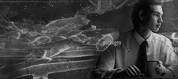
My first sig in a while and my first with CS2 (yay photofilters and other stuff!!!) I used a tut to make this CC&R please

Version 2

« Last edited by Lycanthrope on Apr 13th 2008 »
Version 2
« Last edited by Lycanthrope on Apr 13th 2008 »
[center][b] Damn awesome tag by V-Gamer, thanks breh

The Word Alive - The Devil Inside
PannicC[/center][/b]
The Word Alive - The Devil Inside
PannicC[/center][/b]
Gamerad Posted: 03:01 Apr13 2008
Post ID: 2196812
Gamerad

Posts: 9,040
Post Likes: 1
Post Likes: 1
Um it's ok.
The pen tooling fits in, the colors are nice. And I like the effects.
But it's to sharp, the render doesn't really blend in. And bad text.
The pen tooling fits in, the colors are nice. And I like the effects.
But it's to sharp, the render doesn't really blend in. And bad text.
dragonmaster745 Posted: 03:30 Apr13 2008
Post ID: 2196828
dragonmaster745

Posts: 3,534
Post Likes: 0
Post Likes: 0
text as said in every sig ever. Ya its ok erase the fx over the um render? and well the pen tooling kinda.. idk looks odd.
Name: David
brawl fc: 1418-6442-8427
No 1 Luigi on SC
Name: David
brawl fc: 1418-6442-8427
No 1 Luigi on SC
.Impact Posted: 04:50 Apr13 2008
Post ID: 2196866
.Impact
Resident Graphics Artist

Posts: 4,265
Post Likes: 1
Post Likes: 1
I remember Lycan saying he likes his tags too sharp. :p
jamarie Posted: 15:45 Apr13 2008
Post ID: 2197661
jamarie
Posts: 10,388
Post Likes: 0
Post Likes: 0
I'm the same with sharpness, I like it to look crisp and fresh XD
I would've added some clipping masks with splatter brushing to help blend it in a little at the bottom, otherwise it just looks all thrown together. and yeah, text sucks. I like it, it has something to it I like =]
[right]~ J A M A R I E // C R Y S T A L U T O P I A ~[/color][/right]
I would've added some clipping masks with splatter brushing to help blend it in a little at the bottom, otherwise it just looks all thrown together. and yeah, text sucks. I like it, it has something to it I like =]
[right]~ J A M A R I E // C R Y S T A L U T O P I A ~[/color][/right]
Lycanthrope Posted: 16:11 Apr13 2008
Post ID: 2197721
Lycanthrope
Posts: 1,143
Post Likes: 0
Post Likes: 0
I had no clue where to put text but I wanted text in it. But at least it's an improvement I think of what I last did yay My mojo's coming back! and OMG Jamarie posted in one of my topics!! Ill add clip mask right now seeing as im on my computer and erase some stuff over render. V2 soon!!
[center][b] Damn awesome tag by V-Gamer, thanks breh
The Word Alive - The Devil Inside
PannicC[/center][/b]
The Word Alive - The Devil Inside
PannicC[/center][/b]
Mr.Clueless Posted: 20:44 Apr13 2008
Post ID: 2198132
Mr.Clueless

Posts: 6,127
Post Likes: 1
Post Likes: 1
Well, iut's pretty messy, and, erm... the focal is supposed to be... a robot, right? And, maybe make the background a little more saturated; the colours seem too weak to match the focal.
And so he said, "and there will be delicious cake", and with those words, I said, "I see what you did there..."
Lycanthrope Posted: 20:54 Apr13 2008
Post ID: 2198147
Lycanthrope
Posts: 1,143
Post Likes: 0
Post Likes: 0
How's this Clue?

[center][b] Damn awesome tag by V-Gamer, thanks breh
The Word Alive - The Devil Inside
PannicC[/center][/b]
The Word Alive - The Devil Inside
PannicC[/center][/b]
Mr.Clueless Posted: 21:01 Apr13 2008
Post ID: 2198157
Mr.Clueless
Posts: 6,127
Post Likes: 1
Post Likes: 1
Still messy, but the colours are better.
And so he said, "and there will be delicious cake", and with those words, I said, "I see what you did there..."
jamarie Posted: 12:58 Apr15 2008
Post ID: 2200186
jamarie
Posts: 10,388
Post Likes: 0
Post Likes: 0
^^ Agree-age. Much better and I like the brushing =)
[right]~ J A M A R I E // C R Y S T A L U T O P I A ~[/color][/right]
[right]~ J A M A R I E // C R Y S T A L U T O P I A ~[/color][/right]
galade1495 Posted: 14:34 Apr15 2008
Post ID: 2200271
galade1495

Posts: 2,566
Post Likes: 0
Post Likes: 0
I like it... but the effects at the bottom should be taken, I think.
but the effects towards his legs should stay...
It just looks a bit messy. 0_o
but the effects towards his legs should stay...
It just looks a bit messy. 0_o
[center][ ACCOUNT SWITCHED ]
Personal Stats
Date joined: 20/07/2007
Number of forum posts: 2566
Number of team posts: 7537
Most Improved in The Supercheats 2008 GFX Awards.
2nd place for "Supercheats Member Race Day 2007".
First to lose, 2008 Members Brawl.
[left]July 10th, 2008
Personal Stats
Date joined: 20/07/2007
Number of forum posts: 2566
Number of team posts: 7537
Most Improved in The Supercheats 2008 GFX Awards.
2nd place for "Supercheats Member Race Day 2007".
First to lose, 2008 Members Brawl.
[left]July 10th, 2008
teh Fable Posted: 19:07 Apr15 2008
Post ID: 2200817
teh Fable

Posts: 856
Post Likes: 0
Post Likes: 0
I like it. V2 is better. The fx work, and it isn't too sharp. I just don't like the dull yellow on the right.
You've been improving a lot lately.
You've been improving a lot lately.
Lycanthrope Posted: 19:14 Apr15 2008
Post ID: 2200828
Lycanthrope
Posts: 1,143
Post Likes: 0
Post Likes: 0
see V3 it has saturation. and well I was in a slump before hand but now I got my mojo back.
[center][b] Damn awesome tag by V-Gamer, thanks breh
The Word Alive - The Devil Inside
PannicC[/center][/b]
The Word Alive - The Devil Inside
PannicC[/center][/b]
teh Fable Posted: 21:02 Apr15 2008
Post ID: 2200970
teh Fable
Posts: 856
Post Likes: 0
Post Likes: 0
Mmk, yea, I didn't see that one. That looks better.
Aaden Foli Posted: 22:46 Apr15 2008
Post ID: 2201051
Aaden Foli


Posts: 2,576
Post Likes: 0
Post Likes: 0
A little bit lacking, but good nonetheless.
V2 please.
V2 please.
...
Currently viewing this thread:
REPLY IN THIS THREAD
Smilies, click to use


Users under 13 are not eligible to post on the SuperCheats forums.
