Displaying Page 32 of 38
jamarie Posted: 06:21 Aug13 2007
Post ID: 1834799
jamarie

Posts: 10,388
Post Likes: 0
Post Likes: 0
Thanks, saves me having to open up PS =D
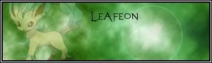
Yeah, I think the BG FX needed to be sharpened a bit more, thanks!
http://s21.photobucket.com/...amma123/

[right]~ J A M A R I E // C R Y S T A L U T O P I A ~[/color][/right]
Yeah, I think the BG FX needed to be sharpened a bit more, thanks!
http://s21.photobucket.com/...amma123/
[right]~ J A M A R I E // C R Y S T A L U T O P I A ~[/color][/right]
danzx Posted: 09:40 Aug13 2007
Post ID: 1835067
danzx
Posts: 6,623
Post Likes: 0
Post Likes: 0
I want the floral thing near yuor name! :D
superknight Posted: 09:46 Aug13 2007
Post ID: 1835081
superknight
Posts: 558
Post Likes: 0
Post Likes: 0
Hey Jamma Can you please make a tut for the sprite sig.I love the Effects
Join my websitePlease.
koolstr Posted: 12:25 Aug13 2007
Post ID: 1835583
koolstr

Posts: 6,630
Post Likes: 0
Post Likes: 0
Yep, like Dan, the flower MUST be next to your name to make it look good IMO. :P
[center]Goodbye, SC...

The person he reminds you of must be a failure of epic proportions in order for there to be any similarity whatsoever.[i] -Pandaemonium
The person he reminds you of must be a failure of epic proportions in order for there to be any similarity whatsoever.[i] -Pandaemonium
jamarie Posted: 13:51 Aug13 2007
Post ID: 1835825
jamarie
Posts: 10,388
Post Likes: 0
Post Likes: 0
LMAO! Trying to suggest something kool?
Done the tut, I'll be posting in a new topic.
Dan: It'sa custom shape on PS. Just click the arrow thing when on custom shapes, then the other arrow then click on all. They have bunnies! XD
[right]~ J A M A R I E // C R Y S T A L U T O P I A ~[/color][/right]
Done the tut, I'll be posting in a new topic.
Dan: It'sa custom shape on PS. Just click the arrow thing when on custom shapes, then the other arrow then click on all. They have bunnies! XD
[right]~ J A M A R I E // C R Y S T A L U T O P I A ~[/color][/right]
danzx Posted: 13:55 Aug13 2007
Post ID: 1835845
danzx
Posts: 6,623
Post Likes: 0
Post Likes: 0
w00t! Bunnies!
TUT! w00t! Gonna do it straight away :D
TUT! w00t! Gonna do it straight away :D
superknight Posted: 14:01 Aug13 2007
Post ID: 1835868
superknight
Posts: 558
Post Likes: 0
Post Likes: 0
Yes thanks Jamma.
Join my websitePlease.
S_Mac Posted: 18:39 Aug13 2007
Post ID: 1836802
S_Mac

Posts: 437
Post Likes: 0
Post Likes: 0
Newest and possibly my best.


Sig and Avy by Proc, Thanks
RJ Fighter Posted: 03:47 Aug15 2007
Post ID: 1840409
RJ Fighter
Super Mod Alumni

Posts: 14,003
Post Likes: 5
Post Likes: 5
Way too plain and the light source needs to blend more.
New stock banner.

New stock banner.
koolstr Posted: 07:31 Aug15 2007
Post ID: 1840710
koolstr
Posts: 6,630
Post Likes: 0
Post Likes: 0
Interesting/nice border....I like the interesting effect, but the text is just decent....this isn't your best IMO, but whatever.
[center]Goodbye, SC...
The person he reminds you of must be a failure of epic proportions in order for there to be any similarity whatsoever.[i] -Pandaemonium
The person he reminds you of must be a failure of epic proportions in order for there to be any similarity whatsoever.[i] -Pandaemonium
danzx Posted: 13:49 Aug15 2007
Post ID: 1841804
danzx
Posts: 6,623
Post Likes: 0
Post Likes: 0
Very plain and monotone. No depth or anything... Not to good. Are you new to sigs?
Liquidize Posted: 14:01 Aug15 2007
Post ID: 1841849
Liquidize
Posts: 6
Post Likes: 0
Post Likes: 0
Its one of my earlier ones. Digging up my photobucket albums and making a new one.

danzx Posted: 14:08 Aug15 2007
Post ID: 1841889
danzx
Posts: 6,623
Post Likes: 0
Post Likes: 0
I like the first one but you didnt really make the logo yourself and the effects are quite simple.
The second one looks really plain. Once again, no depth, lighting or flow. Bad text as well.
The second one looks really plain. Once again, no depth, lighting or flow. Bad text as well.
Liquidize Posted: 14:15 Aug15 2007
Post ID: 1841907
Liquidize
Posts: 6
Post Likes: 0
Post Likes: 0
Yeah, I got the logo from planet renders....
And I forgot to turn antialiasing (or one of them) on when I was typing, and didn't realize until I deleted the xcf.
Different version.
« Last edited by Liquidize on Aug 15th 2007 »
And I forgot to turn antialiasing (or one of them) on when I was typing, and didn't realize until I deleted the xcf.
Different version.
« Last edited by Liquidize on Aug 15th 2007 »
koolstr Posted: 14:31 Aug15 2007
Post ID: 1841950
koolstr
Posts: 6,630
Post Likes: 0
Post Likes: 0
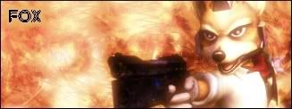
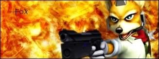
Lol you shoulda called it IceFox lol.
[center]Goodbye, SC...
The person he reminds you of must be a failure of epic proportions in order for there to be any similarity whatsoever.[i] -Pandaemonium
The person he reminds you of must be a failure of epic proportions in order for there to be any similarity whatsoever.[i] -Pandaemonium
megaman935 Posted: 15:03 Aug15 2007
Post ID: 1842033
megaman935

Posts: 523
Post Likes: 0
Post Likes: 0
Nah, aqua fox would've worked better. make it lighter then it could be Ice!
Always forgive your enemies - Nothing annoys them so much
Always forgive your enemies - Nothing annoys them so much
Mac_ Posted: 16:07 Aug15 2007
Post ID: 1842298
Mac_

Posts: 688
Post Likes: 0
Post Likes: 0
I got photoshop cs3 now, so Im trying to get used to Ps again.
koolstr Posted: 16:14 Aug15 2007
Post ID: 1842324
koolstr
Posts: 6,630
Post Likes: 0
Post Likes: 0
Bah, you got CS3 already? Legally or illegally? I'd like to know, to see how you ripped it, and I could do it then. ^^
[center]Goodbye, SC...
The person he reminds you of must be a failure of epic proportions in order for there to be any similarity whatsoever.[i] -Pandaemonium
The person he reminds you of must be a failure of epic proportions in order for there to be any similarity whatsoever.[i] -Pandaemonium
Mac_ Posted: 18:46 Aug15 2007
Post ID: 1842691
Mac_
Posts: 688
Post Likes: 0
Post Likes: 0
Lol, my friend gave it to me.
« Last edited by Mac_ on Aug 15th 2007 »
« Last edited by Mac_ on Aug 15th 2007 »
Displaying Page 32 of 38
Currently viewing this thread:
