PhilXZ Posted: 11:06 Nov29 2008
Post ID: 2490913
PhilXZ
German Wunderkind

Posts: 11,010
Post Likes: 0
Post Likes: 0

Well the time is coming so I thought I'd prepare. I tired to keep the colors on red shades, a Christmas color. Added a few small effects here and there. My GIMP forze when I first tried it and I lost the work, but this one looks better than the one I was about to make. CnC!
-R.R. Posted: 11:42 Nov29 2008
Post ID: 2490925
-R.R.

Posts: 272
Post Likes: 0
Post Likes: 0
Um...
It's highly too monotone, and the text just doesn't fit, like there was a lack of effort.
The brushes of overdone, and take up too much of the tag, and I fail to see any other effects.
It looks like you put everything in and just colorized it all red, and no lighting is present either.
I'm going to be honest, and probably hated for this, but the render or stock or focal or whatever it is looks like a scrotum... ._.
Nashdar Posted: 11:49 Nov29 2008
Post ID: 2490927
Nashdar

Posts: 1,026
Post Likes: 0
Post Likes: 0
Add some colors to the focal or add some colors to the BG. Do something to seperate the two. They are on different levels and are two different things and need something to seperate them from each other.
Gift from Becky, don't look at it too long, beauty might blind you!
Gift from Becky, don't look at it too long, beauty might blind you!
Older Account is "Gamesubmitter" Stats Below
Joined: 29/04/06
Posts: 3225
Joined: 29/04/06
Posts: 3225
Green_Fire Posted: 11:56 Nov29 2008
Post ID: 2490930
Green_Fire

Posts: 2,141
Post Likes: 0
Post Likes: 0
I agree with -R.R. I looked closer and saw...Christmas tree ornaments?
It has been said before though....
NOT ALL TAGS NEED LIGHTING.
You do need a few more colors in there though. Perhaps some green to go with the Christmas theme?
Still looks great, I see effects around the ornaments, and THANK YOU FOR NOT SAYING X-MAS! Hate it when people do that. ._.'
It has been said before though....
NOT ALL TAGS NEED LIGHTING.
You do need a few more colors in there though. Perhaps some green to go with the Christmas theme?
Still looks great, I see effects around the ornaments, and THANK YOU FOR NOT SAYING X-MAS! Hate it when people do that. ._.'
Signature by me
v-gamer Posted: 15:48 Nov29 2008
Post ID: 2491150
v-gamer
y so srs?

Posts: 18,379
Post Likes: 4
Post Likes: 4
It would probably look better if you didn't go mad with brushing the entire sig and without the text. I don't care if it's supposed to be monotone; it looks bad with only one color. Lighting is off, composition is bad, effects are dreadful and are nothing related to Christmas, and depth could use more work. The focus is decent, though.
Phil, I haven't been doing graphics much longer than you have. Unfortunately, I haven't seen you improve the past month. Perhaps you're in a slump?
Just something to consider. However, if you are in a slump, this is a horrible time to continue relying on Brushes for effects in every sig you make.
Phil, I haven't been doing graphics much longer than you have. Unfortunately, I haven't seen you improve the past month. Perhaps you're in a slump?
Just something to consider. However, if you are in a slump, this is a horrible time to continue relying on Brushes for effects in every sig you make.
Avatar: In memory of ieatwyverns <3

Thank you, Vasco <3
Thank you, Vasco <3
Brøken Posted: 16:13 Nov30 2008
Post ID: 2491807
Brøken


Posts: 1,792
Post Likes: 0
Post Likes: 0
If you believe tags don't need lighting, read up or dont post here.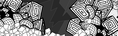
' from the man linkey the frate himself.
' from the man linkey the frate himself.
ozzo Posted: 16:28 Dec01 2008
Post ID: 2492639
ozzo
_________S

Posts: 27,396
Post Likes: 17
Post Likes: 17
well if you didnt tell me it was to do with christmas I wouldn't have known what the hell you just made
it's very monotone. christmas is about gold, greens, silvers etc too. more colour. the composition and font of the text is disturbing.
by now you should really have improved, phil.
good concept, tho
it's very monotone. christmas is about gold, greens, silvers etc too. more colour. the composition and font of the text is disturbing.
by now you should really have improved, phil.
good concept, tho
Currently viewing this thread:
REPLY IN THIS THREAD
Users under 13 are not eligible to post on the SuperCheats forums.
